Let’s take a break from my series of posts on holiday decorations and my recent visit to Seattle. I would love your vote on three new business card options I am considering from Vistaprint (yup, the well marketed/advertised inexpensive business card option).
Since we have transitioned from The Wardrobe Meets the Wall to Inspirational Textiles (see post Improvisational Textiles) I need an updated business card. After playing with endless templates, I have narrowed it my options down to three finalists.
Take a look at the three options below and please cast your vote in the poll below. You don’t need to post a comment to vote but you are welcome of course to also comment.
Please note: 1) The final fonts I am going to use, and how the text is spaced, are not finalized; 2) Since there could always be spammers out there in “blogging-land” I have left off my phone number and e-mail address but they will be in place in the final version; and 3) Ignore the dashed lines at the edge of each card, these are from the Vistaprint template editing and will not appear on the final card.)
I will review the final numbers on Sunday and let you know the top vote and my final decision – thank you!
Option 1

Option 2

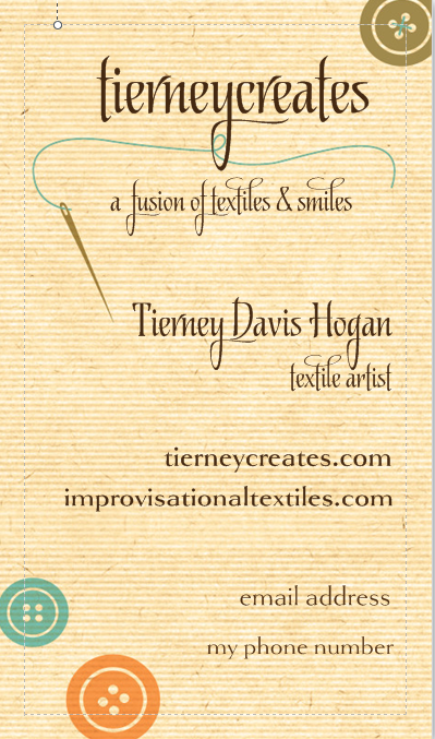
Option 3
Please select one of the options below – thanks!

I like #2 and #3 the best. The green one feels very soothing to me – very artistic. The yellow one is more perky and spontaneous. By those descriptions, which one do you think fits you best? Nice job on both of them.
LikeLiked by 1 person
Thanks and I am not sure yet😀
LikeLike
Hi, Tierney!
I’m not going to vote for 1, 2, or 3… Any of the three would really be “OK”…
But,…
I feel that something else would actually be more reflective of the vibrant, colorful, wonderful artistry that is your beautiful work!!
I would vote to have something that would have a piece from your amazing gallery as the background, or as a side-band!!
(As an example, see the little pictures above that illustrate “related” posts… Or, like the “header” picture of your Gallery…! Wonderful!)
(Tierney, your art is SO much more, I think, than those 3 cards would suggest… )
Blessings!!!
Pat T.
LikeLiked by 2 people
Thanks Pat, I did think of using an image as a background, I did that a couple of years ago but the card looked overstimulating, ha! But I will keep your idea in mind. I might just get a small order of my next set of cards and maybe for my next run I will use a higher end business card vendor with more options😀
LikeLike
The horizontal orientation is easier to read, and #2 is clearer than #1. But I agree that more vibrant color would be more like your work.
LikeLiked by 1 person
Thanks Martha 🙂
LikeLike
These are all very beautiful, though I did cast my vote for one of them. 🙂
I’m wondering if the back of the card (opposite the side with the text) could be a nice place to showcase some of your gorgeous quilting work? Just an idea that came to mind; I’m definitely no expert!
LikeLiked by 1 person
That is a lovely idea about the back of the card😀
LikeLiked by 1 person
Hi Tierney! I voted for number #2. To me it is the most artist and still professional. I like that it has a feeling of texture to it too, as does #3. Congratulations to you on your new future business card!
LikeLike
I really like Option 1 the best. I love the antique feeling this card brings. BUT I do agree with Pat T. about including your work somehow in the card.
LikeLiked by 1 person
Terry the Quilting husband said he was voting for that one too (he now reads my blog regularly to see if I mentioned him or if Sassy has a new post, ha!)
LikeLike
You didn’t make that easy. If it were me,I would probably do number 3 but my sister would do number 1 and my mom number 1 or 2. Close your eyes and point to one. Any choice is lovely.
LikeLiked by 1 person
I know each time I think I like one better I change my mind!
LikeLiked by 1 person
At first I was going to say two, but I’m going to cast my vote for three.
Typography is good.
Variations of line weight add contrast as much as the dark color vs the background.
And the flowing typeface reminds me of thread, tying in the general theme subtly.
I usually don’t like vertical business cards, but this one stand out as much as it stands up. I like. 🙂
LikeLiked by 1 person
Awesome Jesse! Thanks for your detailed feedback and insight! You approached it from an artistic viewpoint! 😀
LikeLike
Option 3. Option 1 looks too busy to me; option 2 too conventional. Option 3 just right! Cheers! Goldilocks 😀
LikeLiked by 1 person
Thanks so much for weighing in!
LikeLike
1! It just stands out to me the most and catches my attention. I hope I’m not too late!
LikeLiked by 1 person
Thanks for your comment and I am not going to check the tally until Monday when I reveal the results. 🙂
LikeLike
I like the artistic feel of # 1
LikeLiked by 1 person
So which card did you decide to go with?
LikeLiked by 1 person
the third one 🙂
LikeLiked by 1 person
Awesome…love the design!
LikeLiked by 1 person
Number three have texture and really distinct from crowd. Number one have nice background img but I am still for something different. When you take in hand lot of business cards number three will leave impression.
LikeLiked by 1 person
Thanks for your thoughtful comments 😀
LikeLike