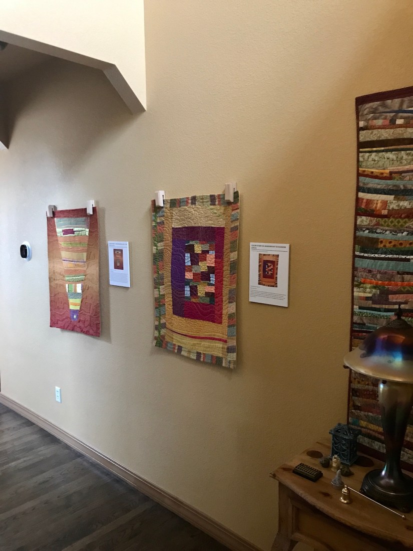
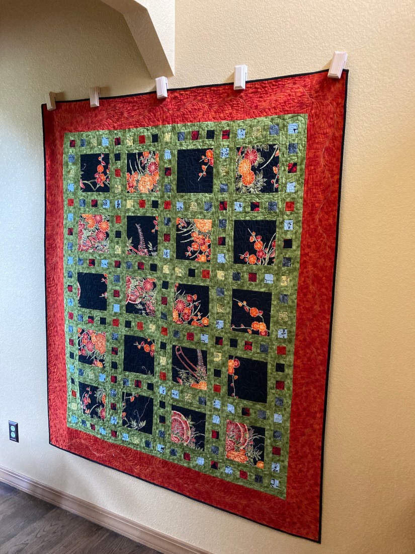
Last week I rotated the quilts hanging in my entry hall from several of my recycled silk art quilts to a quilt I made in the early 2010s (perhaps 2010 or 2011) that was one of my first attempts of experimenting with bold colors.
Rotated from this:
to this:
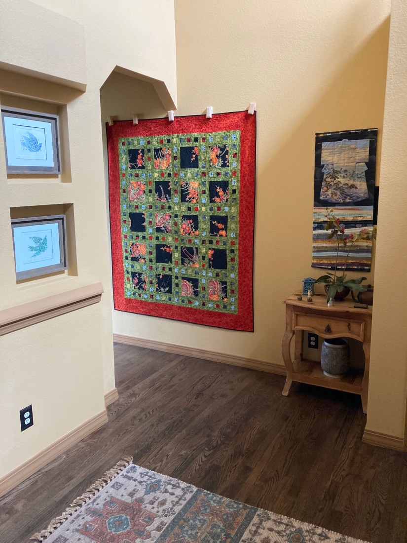
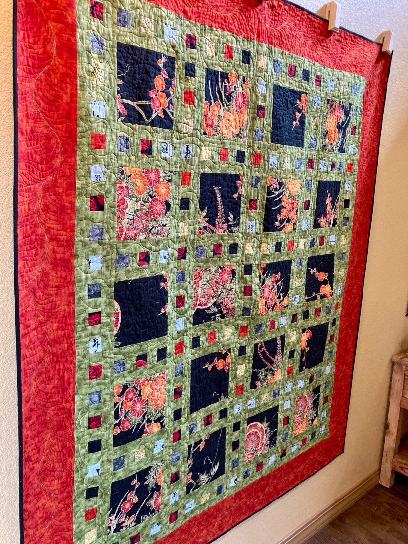
This quilt, which I will call Asian Fabric Slide Show, is from the pattern Slide Show by Atkinson Designs. If you are a quilter, and I have been to a quilt shop in the past 15 years, then likely you’ve seen this pattern – either available for purchase, or as a sample quilt, or as both.
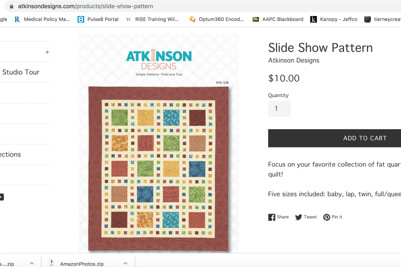
It is a very common quilt pattern and before I made the quilt I’d seen many version of it, many which looked similar to the quilt in the image above from Atkinson Design’s website.
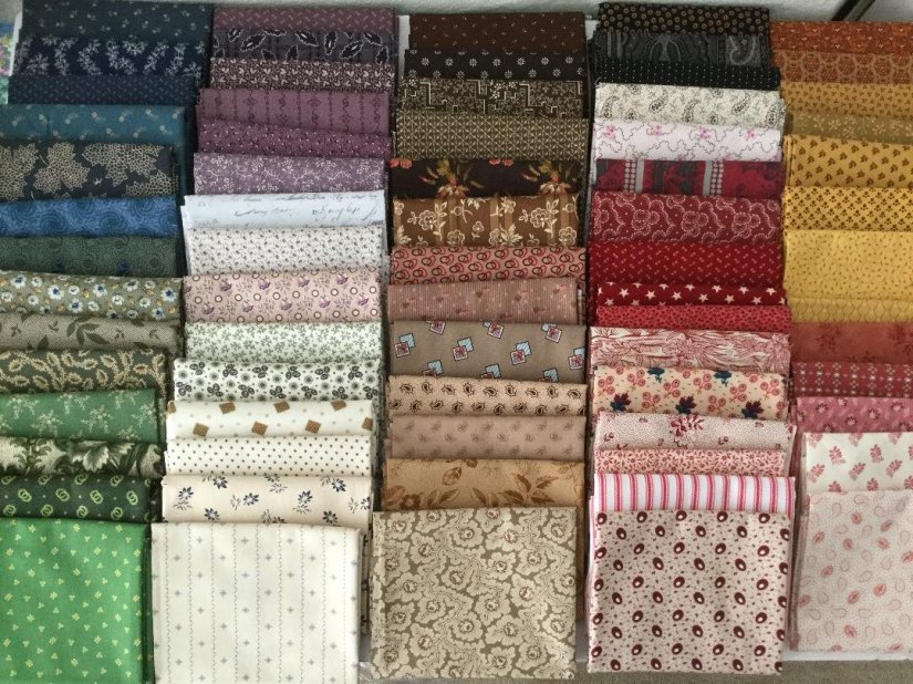
Before making this quilt I had begun to experiment a little with color, especially with batiks, which I had recently discovered. And before that I was making quilts with traditional looking quilting fabrics and colors. My original palette (especially when I began quilting around 1999/2000) was blue, red, green, cream, purple, white, mauve.
I found this image on twobeesfabric.com and it looks like my old fabric palette:
 Somewhere in the late 2000s as I began to make quilts with batik fabrics, I became attracted to strong/bold colors.
When I decided to make the Slide Show quilt, I decided to make unconventional choices including using a “featured fabric”/main fabric with a non-repeat pattern (which was more like a panel than traditional fabric yardage).
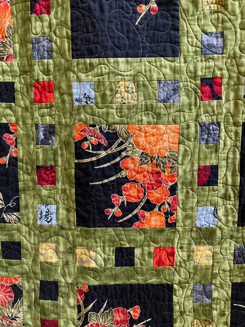
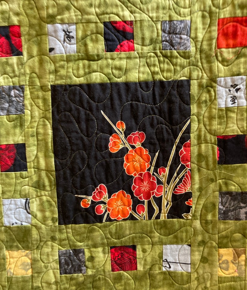
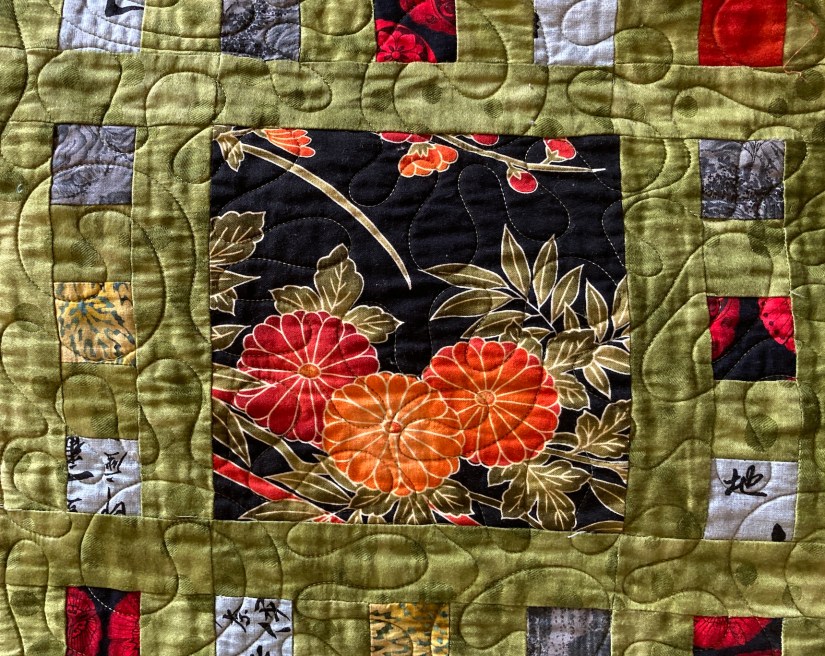
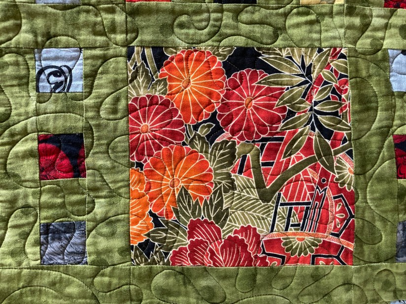
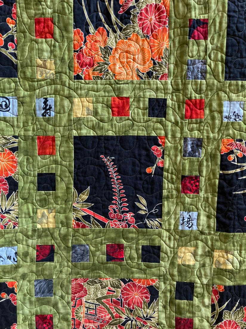 For the little blocks surrounding the larger squares, I decided to experiment with adding a fabric that WAS NOT in the featured fabric but added a pop of color that appeared to go well with the other fabrics which were coordinated.
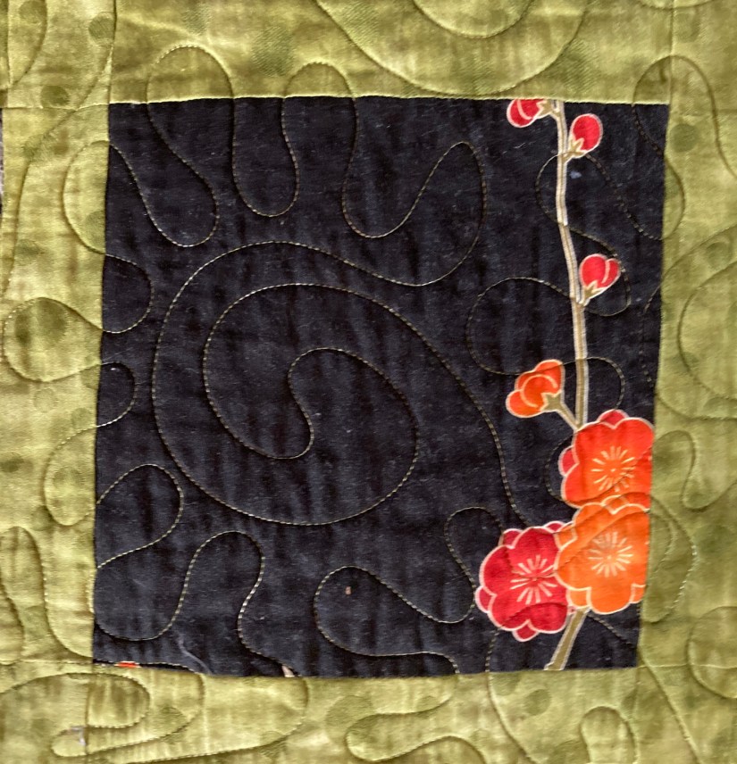
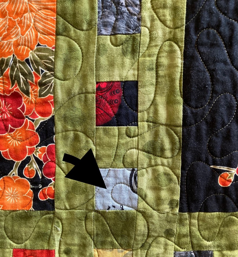
I used a light and iridescent bluish gray fabric for this experiment with “non-matching the featured fabric” (see arrow in image below):
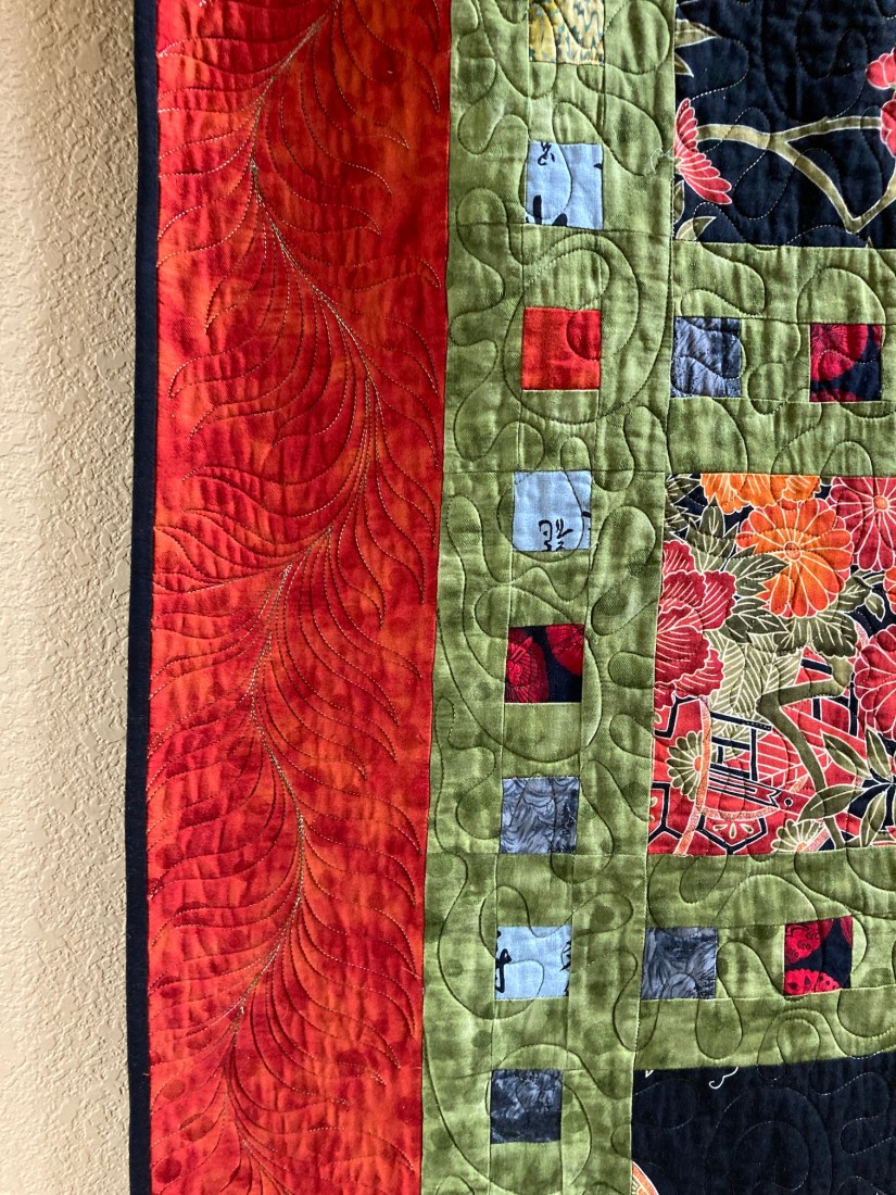
 Then I got really crazy with the quilt and added a very strong deep orange as the border. I’d never used this much orange in a quilt before. In the past I would have used the green I used in lattice or a black as the border. I am not sure what got into me but I decided to make the border really pop!
 It wasn’t until I recently rotated the quilts in the hallway that I remembered this part of my quilt journey.
After this quilt, bold color became part of my design/quilt journey as evidenced by my series of recycled silk quilts – the Color Story Series.
Here is one from that series with a crazy amount of bold color:

If you like, please share in the comments, a little about your color/colour journey in your art (whether you are a quilter, knitter, painter, ceramicist, etc.)!
Postscript
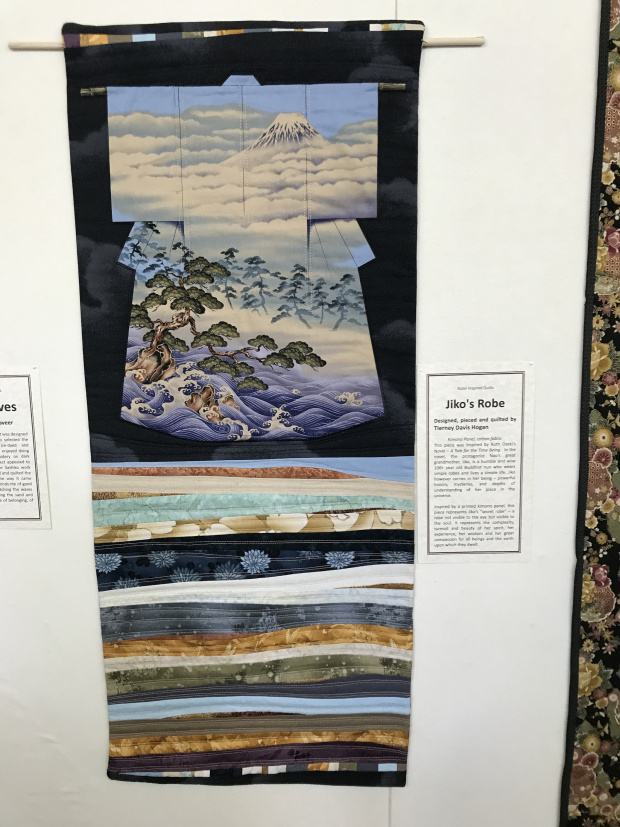
In case you are curious about the kimono quilt to the right of the quilt discussed in this post:
You can read about that quilt in an old post from June 2017:
Jiko’s Robe at QuiltWorks Gallery, June 2017