
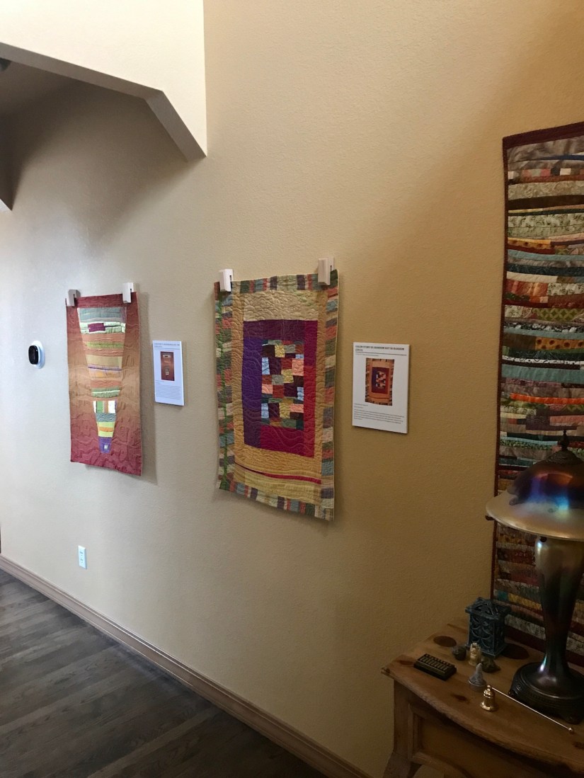
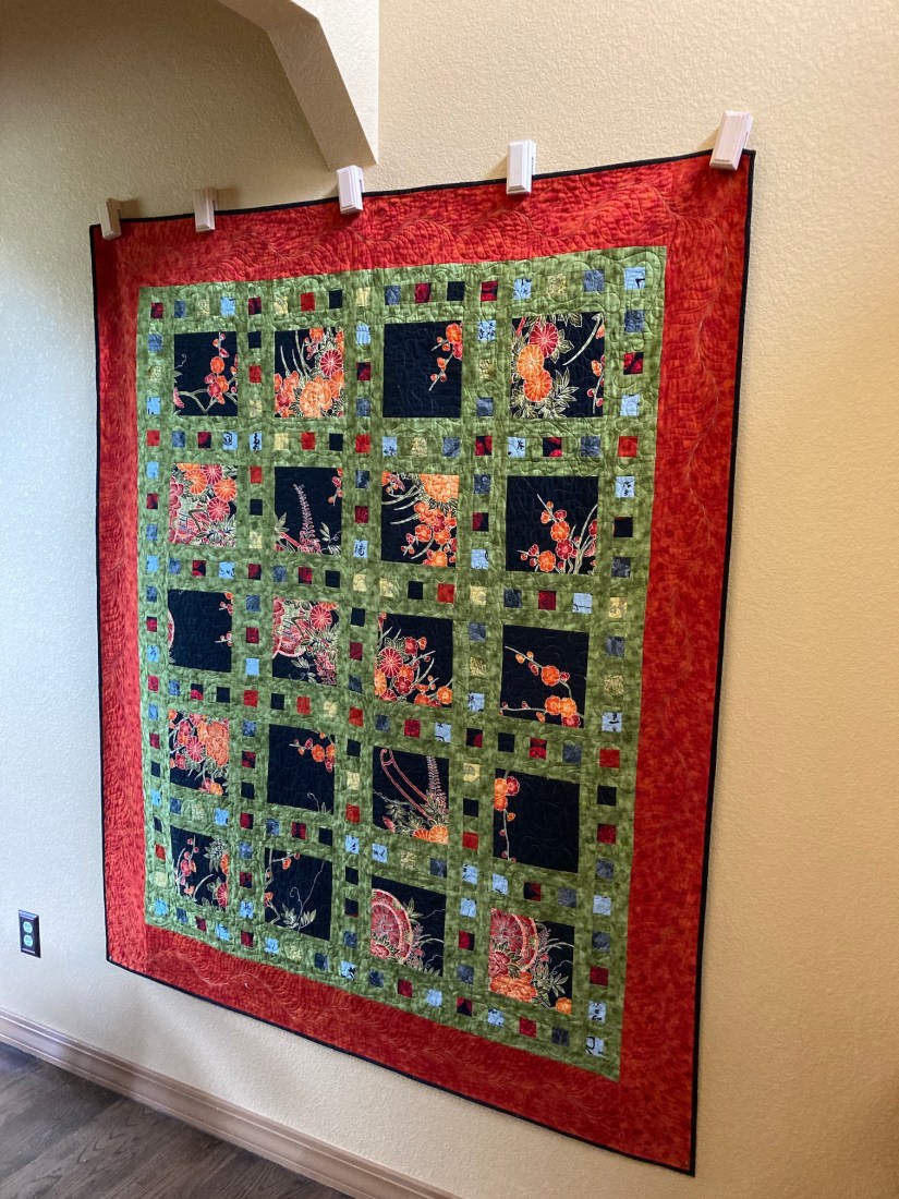
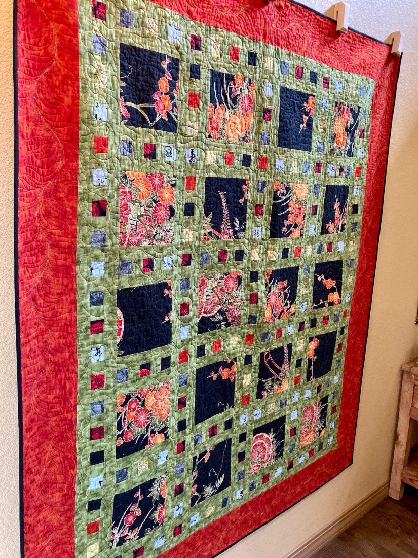
Last week I rotated the quilts hanging in my entry hall from several of my recycled silk art quilts to a quilt I made in the early 2010s (perhaps 2010 or 2011) that was one of my first attempts of experimenting with bold colors.
Rotated from this:
to this:
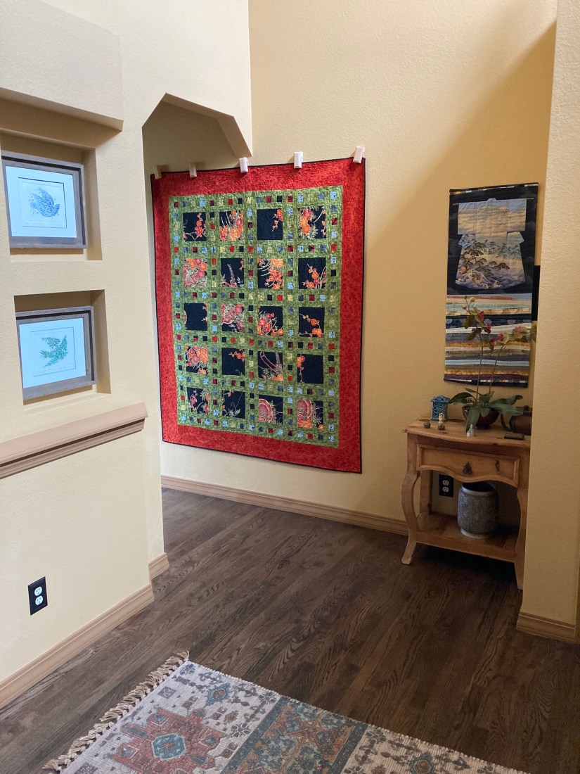
This quilt, which I will call Asian Fabric Slide Show, is from the pattern Slide Show by Atkinson Designs. If you are a quilter, and I have been to a quilt shop in the past 15 years, then likely you’ve seen this pattern – either available for purchase, or as a sample quilt, or as both.
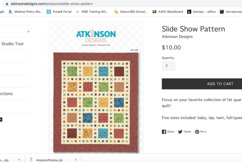
It is a very common quilt pattern and before I made the quilt I’d seen many version of it, many which looked similar to the quilt in the image above from Atkinson Design’s website.
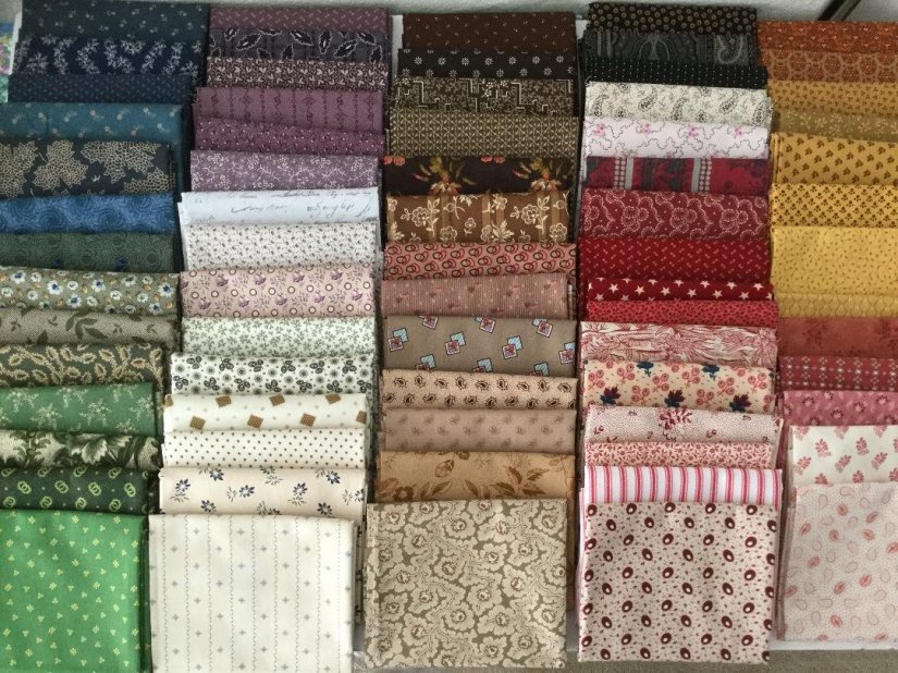
Before making this quilt I had begun to experiment a little with color, especially with batiks, which I had recently discovered. And before that I was making quilts with traditional looking quilting fabrics and colors. My original palette (especially when I began quilting around 1999/2000) was blue, red, green, cream, purple, white, mauve.
I found this image on twobeesfabric.com and it looks like my old fabric palette:
 Somewhere in the late 2000s as I began to make quilts with batik fabrics, I became attracted to strong/bold colors.
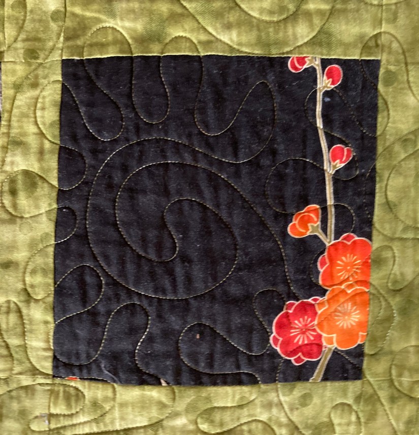
When I decided to make the Slide Show quilt, I decided to make unconventional choices including using a “featured fabric”/main fabric with a non-repeat pattern (which was more like a panel than traditional fabric yardage).
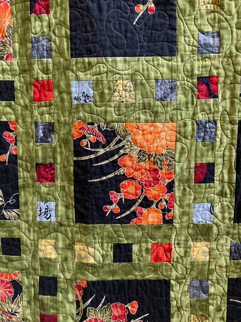
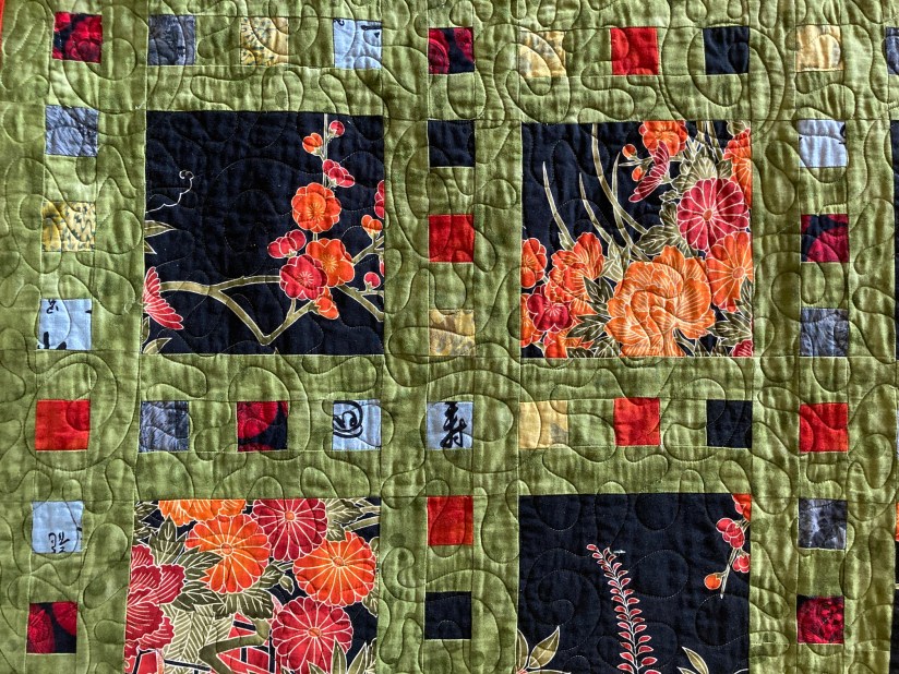
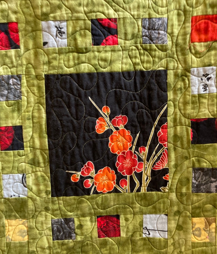
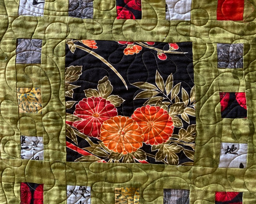
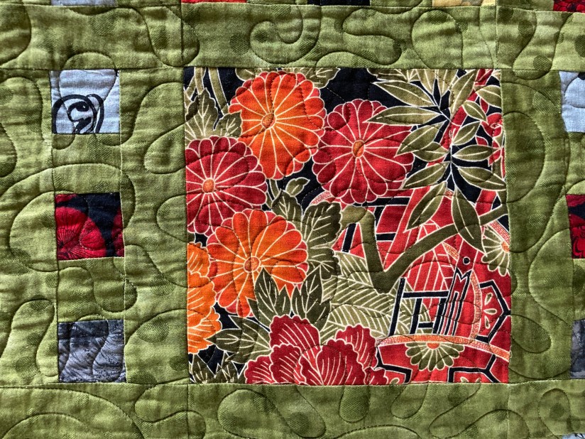
 For the little blocks surrounding the larger squares, I decided to experiment with adding a fabric that WAS NOT in the featured fabric but added a pop of color that appeared to go well with the other fabrics which were coordinated.
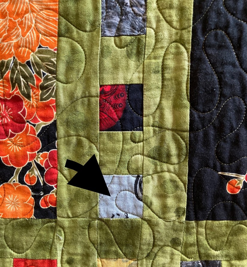
I used a light and iridescent bluish gray fabric for this experiment with “non-matching the featured fabric” (see arrow in image below):
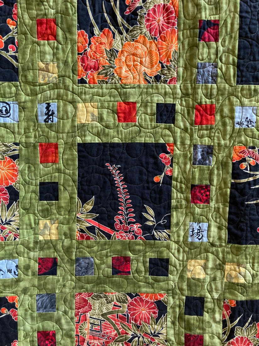
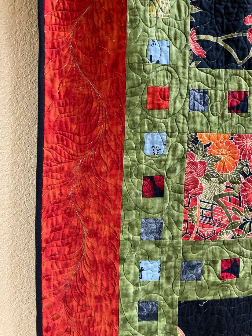
 Then I got really crazy with the quilt and added a very strong deep orange as the border. I’d never used this much orange in a quilt before. In the past I would have used the green I used in lattice or a black as the border. I am not sure what got into me but I decided to make the border really pop!
 It wasn’t until I recently rotated the quilts in the hallway that I remembered this part of my quilt journey.
After this quilt, bold color became part of my design/quilt journey as evidenced by my series of recycled silk quilts – the Color Story Series.
Here is one from that series with a crazy amount of bold color:

If you like, please share in the comments, a little about your color/colour journey in your art (whether you are a quilter, knitter, painter, ceramicist, etc.)!
Postscript
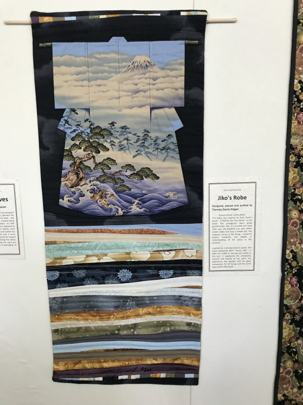
In case you are curious about the kimono quilt to the right of the quilt discussed in this post:
You can read about that quilt in an old post from June 2017:
Jiko’s Robe at QuiltWorks Gallery, June 2017

Oh, I love this one so much! That orange does pop! Gorgeous!
LikeLiked by 1 person
Thank you Robin 🙂
LikeLike
love the slide show quilt!
LikeLiked by 1 person
Thanks so much 🙂
LikeLike
You have made some really gorgeous pieces!
LikeLiked by 1 person
Thanks I really appreciate that 🙂
LikeLike
I love all of the quilts in these pictures. It’s got to feel good to look back and see where the shift to bold happened. The kimono one is so pretty also.
LikeLiked by 1 person
Thanks so much and thanks for stopping by 🙂
LikeLiked by 1 person
You are very welcome. My pleasure!
LikeLike
I love the bold colors, especially that orange.
LikeLiked by 1 person
Thank you and thanks for stopping by 🙂
LikeLike
So cool you use your quilts as Art in your home. That’s terrific!
LikeLiked by 1 person
Thanks so much 🙂
LikeLike
I’m mainly a “brighter the better” kind of artist. But there are times when I’ve been attracted to a more or less sepia look. Right now I’m using some brights but in differing ways on some new kinds of “paper” I’ve never used. And at the same time using up a brand of paint, that I don’t care to use anymore and I don’t want to truly waste it all…no point in binning it. So a lot of paper is getting to one colourway which in turn gets to be part of collage medium…
LikeLiked by 1 person
Thanks so much for sharing your colour journey – it sounds like your palette is flexible and fluid! I do like to get away from strong colour and experiment with neutrals too! The sepia look is so cool!
LikeLike
I have so enjoyed reading the story of your adventure with colour and it is good that this lovely quilt is hanging in your hallway.
My very first quilt is so bright that it is an eyesore! Lime green, orange, turquoise, yellow, white (!) and some dark blue to tone it down (ha ha). I had signed up for a workshop on HSTs and asked my then ten-year-old daughter to choose the fabrics. So it was her colour choice and the result was a gaudy radiating star in quite large HSTs. But she loved it and slept under it for many years.
LikeLiked by 2 people
Mariss – thanks for sharing your story – it made me smile! I’ve made a quilt of a “curious colour palette” in the past before and surprisingly the recipient totally loved it! So glad you daughter got to be part of the fabric selection and then got to snuggle many years under the quilt!
LikeLiked by 1 person
Love the colors! I am still developing in my color journey. When I started quilting, I was pretty much “matchy-matchy” in my fabric selection. As I wander into scrappy art and venture into improvisational pieces, I am playing more with color. I am presently working on a scrappy quilt where I just picked fabrics that caught my eye…no other rhyme or reason. Don’t know how it will turn out. I learn so much from your blogs. So, let the color journey continue.
LikeLiked by 1 person
Wow! What a focal point! Such a beautiful piece.
LikeLike
I really like this quilt! The added gray-blue was such a good decision. The memory your quilt jogged was more about prints than color. I had started out thinking one could use only small prints. Along came a Quilters’ Newsletter article exploring large prints. Cut small, with no attempt at cutting a similar part of the print for each piece. ( The term ‘fussy cut’ was not yet in use. ) It created a “faerie fey” quality, the writer said.
LikeLiked by 1 person
Oh that’s really cool that you were able to have the freedom to move from small prints to large prints! I love Quilter’s newsletter I should probably read it again! Thanks for your comments 🙂
LikeLiked by 1 person
Just wow.
LikeLiked by 1 person
Thanks so much Claudia 🙂
LikeLiked by 1 person
That is a lovely quilt! I love the fabrics you featured in the main squares and how all the little accent squares really add to the whole piece. And I love the orange! It really makes everything sing 🙂
LikeLike
Slide Show is very pretty! I don’t think I have to tell you about my color pallet. You are probably very familiar with it.
LikeLiked by 1 person
Oh yes Cindy and I LOVE YOUR COLOR PALETTE! Thanks so much 🙂
LikeLiked by 1 person
Nice displays! And I love bright colors 🙂
LikeLiked by 1 person
Thanks so much 🙂
LikeLiked by 1 person