
Check out Sassy the Highly Opinionated Miniature Schnauzer’s blog on SchnauzerSnips, for her latest musings…
BRIGHT COLOR!!!
One of my blogging-buddies, Laura @ Create Art Every Day, recently asked me in response to my comment on one of her post:
Have you ever done a quilt with lots of white or neutral (back)ground mixed with really bright brights?
Her timing on this question is amazing as I just returned from a four-day quilt retreat with some of my Quilting Sisters and some new quilting friends I met at the retreat. While at the retreat I worked on free-form piecing of log cabin blocks (“log jamming”).

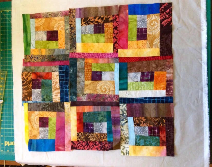
These blocks started as bag of colorful batik fabric scraps:

I trimmed each block to a 6″ x 6″ block and I have scraps left over from trimming the blocks and I am going to use those “trimming scraps” and the rest of the scrap back to make more blocks.

Now here is where I need your help – I am trying to decide what background color to set the blocks into and what layout. I would appreciate input from crafters and non crafters – I want to know what you find most aesthetically pleasing:
OPTION 1A – Float the blocks individually in a neutral background:

OPTION 1B – Group the blocks together and then float the whole grouping in a neutral background:
OPTION 2A – Float the blocks individually in a gray background:

OPTION 2B – Group the blocks together and then float the whole grouping in a gray background:
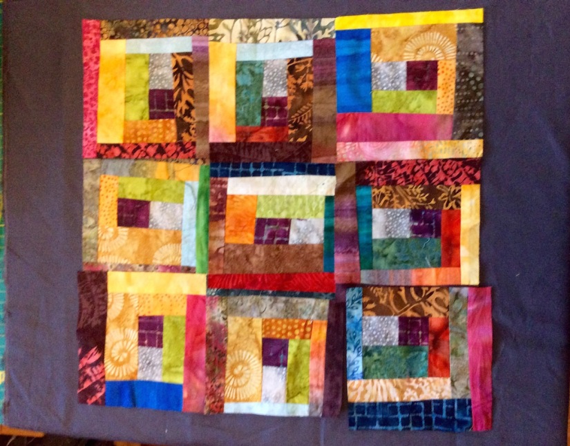
This dilemma is actually the fault of Laura @ Create Art Every Day (ha!) as originally I had purchased the gray fabric during the quilt retreat to float the blocks. Then I was inspired by Laura’s comment to float the blocks in a neutral background!
I am stuck and would appreciate your vote and any comments you want to make regarding your rationale. THANK YOU!
In my next post I will share what the other quilters were working on at the quilt retreat I recently attended and some cool fabric finds (in addition to the one mentioned in “Postscript”).
POSTSCRIPT
Frivolous Purchase
Speaking of “Bright Color“, while at the retreat, I bought a frivolous but cool piece of fabric – a panel by Hoffman Fabrics of their entire Hand-Dyed Batik Watercolor Palette:

It is now hanging in my studio.
I do love bright colors and here are the quilts I keep on the chair in my studio. The two on the left are made by my Quilting Sisters (Judy D. and Kathy R.) and I was rotating them as wallhangings in my studio prior to getting the Hoffman Batik panel. The one on the right is my first experiment with creating Half-Square Triangles with charm squares using a Batik charm back I bought in the early 2000s (I made this quilt around 2003).

A Blog Recommendation
I follow many wonderful blogs by other crafters, quilters, painters and other artists. I also follow inspirational blogs by non-crafters. Please see my “Blogs of Follow” list section of my Home page.
I was fortunate to discover (I think by a comment on one of my blog posts) a blog by a Nigerian quilter – Sola, called Alice Samuel’s Quilt Co. Her blog is very interesting to read from a quilter’s perspective outside the US. I have also come across various wonderful Australian and UK quilter blogs.
I love how quilting connects us across the globe!
In Sola’s latest post, she has a wonderfully researched (with lots of links to resources) post on:
The Quilting Process: Basting your Quilt
Thanks to my fellow bloggers for their engaging blogs I love following; and thanks to the tierneycreates readers/followers (extra thanks to those who take the time to comment on posts). I feel very blessed! (huge smile).

I would group them together on a neutral background not trying to make them perfectly square. I would use Misty Fuse to attach them.
LikeLiked by 1 person
Thanks Cindy!
LikeLiked by 1 person
You certainly know how to make my day Tierney…thanks a lot for recommending my blog and for the ping back on the post, it means a lot! Now to your question very nice blocks and batiks are really lovely. For me I like the blocks floating individually and I prefer the gray background just because white background seems too stark and a little too in your face unless that’s the effect you were going for.
LikeLiked by 2 people
Thanks Sola for your input! I am really enjoying your blog and was happy to give a “shout out” to it! 🙂
LikeLiked by 1 person
I’m thinking maybe just stitch the blocks together, use a pieced binding to enclose them – no bigger backing at all! They speak so well on their own! Just a thought.
LikeLiked by 2 people
That is not a bad idea! Thanks so much for your comment!
LikeLike
This is hard! I get caught up in the outside colors of the squares. The neutral background allows all of the dark colors to stand out where the grey kinda makes the darker colors like the blues stand down so they are not as bam! (in the picture on the computer anyway…not sure about real life…so hard to tell in pictures for me). The yellows look great against the grey and so do the reds and kind of pinky rose colors and the greens and browns.
I am thinking group them together on the grey but make sure all blue sides are facing opposite of the grey fabric and placed up against another block rather than up against the grey fabric not allowing a blue side to but up against another blue. Have no idea if I am making sense. Everything is so subjective ya know? And…I am not a quilt maker! It is hard for me to visualize. I love batik btw.
LikeLiked by 2 people
Yes but you are a painter and from what I can tell from your blog/your painting – you have a great sense of color! I appreciate your rationale on both options. it is like the piece would be okay with either background (or maybe no background which was another options). It is great to get all this input!
LikeLiked by 1 person
Thank you very much. I agree with you, I think the piece would work however you do it and it is just a matter of personal taste…
LikeLiked by 1 person
Hi Teirney, Ooooh, I love to put in my 2cents worth. LOVE the Log Cabin quilt. The way I would do it- float each block individually, with a PURPLE or RED background- keep the color going! And maybe put a yellow square at each “intersection”, if that sounds clear. The gray fabric showed up purple, so that is why I thought of that- but red is my go to color….I think. Right now it seems to be an olive green.
Love your posts.
LikeLiked by 1 person
Funny, purple had crossed my mind also. Red – what a fantastic idea too! Thanks😀
LikeLike
I think the brights look brighter against the gray. I rather like them grouped together unless you do the angled positioning like a couple in the first photo.
LikeLiked by 1 person
You know Claire, that is why my fellow quilters at the retreat said in regards to the gray – they thought it would be perfect. I had not however presented the neutral as an option. Thanks for your input!
LikeLike
Option 1A! Love your blocks!
LikeLiked by 1 person
Thanks! I appreciate your vote😀
LikeLike
I like floating on white. I too like bright colors, and floating them makes each square stand out. Grey is a downer to me, and mutes the colors. I light golden brown would be nice also.
BTW, I don’t quilt, but secretly think about it. I do make jewelry, fused glass, knit, and die cloth–the more bling the better. I rarely use neutral colors in any of those, though
LikeLiked by 2 people
I think I lied–I have done some crazy quilting, along with silk ribbon embroidery–and embroidery and needlepoint
LikeLiked by 1 person
Thanks so much for your thoughts on this – good point on the gray – I never thought about it that way! Golden brown is a nice idea too, thanks!
LikeLiked by 1 person
Thanks so much for the link, Tierney! To me, option 2A was leaping out and waving both arms as the obvious choice. Usually I angst over such things but not this time. I think the dark ground is definitely it for this piece. They get lost on the white, I think. And I think separating them makes each have a stronger impact vs having one blob of color on the dark ground. I agree with some others are dark brown, plum, dk red, I’d be inclined to try them on different ones and see which calls loudest. I start to wonder if it’s be even better on the dk brown. I do wonder about too much bright and not giving the eye a chance to rest also. Saying all that, it is your piece and is certainly gorgeous!!! And you have to go with what speaks the loudest to you. Really stunning. And holy heck, I’d have bought that Hoffman piece too!!! I’ve always loved their fabrics. Gorgeous and inspirational!! Again, thank you and I am so happy to see your latest piece of loveliness. 💜💜💜
LikeLiked by 2 people
Wow Laura, thanks for your in-depth comment. I get more and more excited about this piece (however it comes out) by reading the comments. You all inspire me so! I am thinking about the red too that someone else mentioned as that would really bold and crazy of me as I never use red like that! I do also love the neutral. I am leaning away from the gray at this point. Of course brown is awesome too. More to come on this piece!
LikeLiked by 1 person
I’m dying to see where you go with it 💜💜💜
LikeLiked by 1 person
PS re my comment about too much bright, I mean in terms of considering the borders/ground. The blocks are ‘wow’ gorgeous!!!
LikeLiked by 2 people
I thought about brown too Laura…
LikeLiked by 2 people
I think a chocolate brown would be so cool. I have a mottled batik feeling one that reads as one color from a distance but you can see the texture up close and it’d be gorgeous. Quilting is so much fun. Well, not the sewing part lol. But I love the design side. Even a really dark red with a lot of brown in it would be good. I need to take another look at the blocks. If I could mix quinacridone gold with a little van dyke brown, that’d be a great color too! 💛
LikeLiked by 2 people
Brown or golden brown like another commenter mentioned would be very nice. I love batik!
LikeLiked by 2 people
Heck yea me too.
LikeLiked by 2 people
I love brown too as an option, I did pull some brown out my stash and play that with it too, as well I am going to pull out red and purple. Okay now my studio is a mess – ha!
LikeLiked by 2 people
I bet your studio is a mess! I can’t wait to see what you end up doing with this quilt…
LikeLiked by 1 person
Ok and then I just need to add – whatever you decide it will be awesome. Because you are really good! But if I could mix a color for this, I would take a deep gold and add some brown to it. Just my .02!
LikeLiked by 1 person
Laura and Dawn – I have been enjoying this discussion thread – thanks for mulling over my piece!
LikeLiked by 2 people
I have not yet started dyeing my own fabrics – ha! (that would be the only way to technically “mix a color” when it comes to textile arts 🙂 (I think…)
LikeLiked by 1 person
Lol true
LikeLike
Too much input yet? 🙂 I would make more blocks, group them without sashing or a border, and bind with a pieced binding. That eliminates a lot of the contrast (and I do love contrast,) but I think the blocks are so pretty that I don’t want to stop the flow of them with sashing.
OR if you do want separation, don’t set them straight, in rows and columns. Use your separator in more random sizing — perhaps framing each one with the same fabric but in wonky widths. It might be easiest to pull off with a fabric that has some pattern so the seams between newly framed blocks disappear a bit. I have a quilt downstairs — will email you a photo.
LikeLiked by 1 person
Never too much input – I love it! I wish we were all sitting around in a room over tea and cookies and discussing the piece – this has been very fun! I really like your idea of wonky width. If you don’t mind I am going to add to my next post on this piece the photo you e-mailed me of your piece – great layout!
LikeLike
Yes, you are welcome to include it. Of course credits… 🙂
LikeLike
Another thought: If you really want to set them apart on a different background, what about looking at either a gold dupioni or a deep purple dupioni? I still like the idea of grouping them together – for the huge impact that would have, BUT…the idea of gray or white just seems to work to lessen their impact. Unless maybe you were to sash each in something more wild, like solid black, or solid purple, THEN put them on the plainer background. OH my, I’m giving this way too much thought! LOL
LikeLiked by 1 person
First I have to tell you I love how your adorable dog is your avatar for your responses. I feel like a cute pup is giving me great advice – ha! I love your ideas too. Gold would be lovely too! I have some gold fabric by Moda I bought during the retreat too (will show it on my next post).. I appreciate all the thought and all the comments – this has been so fun! 🙂
LikeLiked by 1 person
Option z: I love love love the blocks, but am partial to flashy colors mounted on a white background. I also like sashing between the blocks because it makes each one pop…call me old fashioned?
LikeLiked by 1 person
Option Z – ha! Thanks and I did for a moment think of white. that would be more striking than the neutral tan-like color. More to come 🙂
LikeLike
I like Option 2A, the gray fabric helps all the colors stand out. I also like the stuffed Schnauzer supervising Sassy under the Hoffman panel! Someone (or something) needs to keep an eye on that spunky girl!
LikeLiked by 1 person
Thanks! Yes many schnauzer kitsch around my house!😀
LikeLike
While I like both versions of placing all the blocks together and placing with sashing, I would need to try the sashing version using a variety of sizes and different shades of either the light or the grey.
LikeLiked by 1 person
Thanks so much for your thoughts! I am working on a couple more blocks and then will have a follow up post on this😀
LikeLike
I had a weird typo on my previous response that is now fixed, thanks for your input!
LikeLike