My next post was going to be about the cool projects other quilters were working on at the retreat (tuffets!) I attended last weekend. However, I do not want to lose the momentum from the project discussed in my Thursday 08/11/16 post –What’s on the Design Wall (Need Your Help).
I so appreciate all the enthusiastic responses, votes, and ideas. I have to tell those of you who commented: You made a MESS of my studio (smile)!

You should have seen my little studio – various fabrics pulled out from my stash in many different colors, from your suggestions, strewn about everywhere. It was like a tornado of fabric options had blown through.
Reading all the comments was very fun – it was like you all were crammed into my tiny studio (where would I fit you all?!??!) and we were looking through my stash together and throwing around ideas (and fabric).
Of course, I would have to plan a snack and beverage for all my studio guests crammed into the tiny room…but where would I set out the plates and cups? (Maybe I could go scavenge some more fruit from my neighborhood to serve as snacks…but that is an upcoming post: Fruits of My Neighborhood Part III!)
THE RECAP
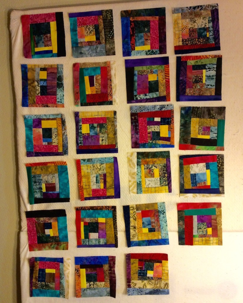
- This project began with a bag of colorful Batik scraps (that I embarrassingly actually purchased…in a moment of weakness from the Stitchin’ Post quilt shop’s basket of scrap bags for sale..that shop is loaded with temptation!)

- I turned many of those scraps into 24 6′ x 6″ blocks:

- I presented four (4) options for the layout on the blocks and here are the votes by Option:
- OPTION 1A – Float the blocks individually in a neutral background: 2 Votes
- OPTION 1B – Group the blocks together and then float the whole grouping in a neutral background: 0 Votes
- OPTION 2A – Float the blocks individually in a gray background: 4 Votes
- OPTION 2B – Group the blocks together and then float the whole grouping in a gray background: 2 Votes
- In addition to voting on options I presented, many of you in your comments suggested different options (I hope I captured the essence of all the comments to date, my apologies if I left a summary of your comment out below):
- Group them together on a neutral background not trying to make them perfectly square, use Misty Fuse to attach them
- Stitch the blocks together, use a pieced binding to enclose them, they speak so well on their own!
- Group them together on the grey but make sure all blue sides are facing opposite of the grey fabric and placed up against another block rather than up against the grey fabric not allowing a blue side to but up against another blue.
- Float each block individually, with a PURPLE or RED background- keep the color going! And maybe put a yellow square at each “intersection”
- Golden brown would be nice also (to float blocks).
- I agree with some others are dark brown, plum, dark red, I’d be inclined to try them on different ones and see which calls loudest.I start to wonder if it’s be even better on the dark brown.
- I think a chocolate brown would be so cool.
- I would make more blocks, group them without sashing or a border, and bind with a pieced binding (NOTE: I did make more blocks, see below!)
- If you do want separation, don’t set them straight, in rows and columns. Use your separator in more random sizing — perhaps framing each one with the same fabric but in wonky widths. It might be easiest to pull off with a fabric that has some pattern so the seams between newly framed blocks disappear a bit.
- If you really want to set them apart on a different background, what about looking at either a gold dupioni or a deep purple dupioni?
- (from a text to my phone, not posted to the blog) What came to mind was floating blocks in a round of neutral logs then a round of gray logs – maybe alternate with the reverse – round of gray first then neutral – then you float and have blocks side by side – and I’m thinking of a neutral acid yellow or lime green or maybe an acid yellow orange – a crisp bright marigold color – all would look good with the blocks and gray.
- Option Z: I love love love the blocks, but am partial to flashy colors mounted on a white background. I also like sashing between the blocks because it makes each one pop.
- While I like both versions of placing all the blocks together and placing with sashing, I would need to try the sashing version using a variety of sizes and different shades of either the light or the grey.
- One fellow blogger, Melanie @ Catbird Quilt Studio was kind enough to e-mail me a photo of one of her lovely scrappy log cabin quilts, “Broken Pains” as an example of a layout she used:

- In addition to showing you the scraps I started with, in the previous post I shared the pile of scraps I had left over from trimming the original set of blocks down to a 6″ x 6″ size:

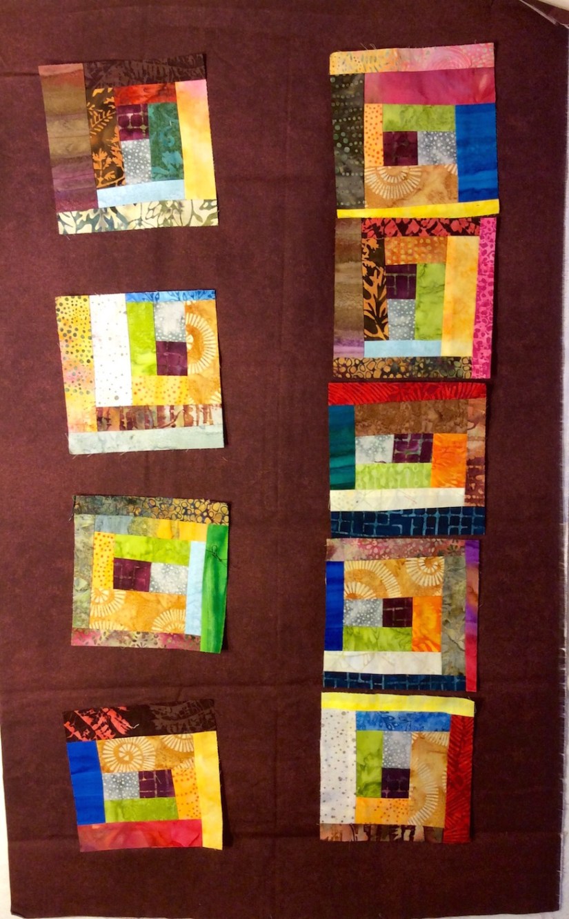
- In the evening on Friday and Saturday, I turned the trimmings from those scraps and some of the remaining scraps into 23 more 6″ x 6″ blocks:
- I now have scraps left over from trimming the latest blocks and the remaining original scraps that started it all…and yes, I am going to make more blocks out of them! (Besides 47, 24 + 23, is an usual odd number of blocks. )

THE EXPERIMENTS
I tried out many of your color suggestions. To save time, I had a “pocket full of scrappy blocks” as I experimented. I never imagined walking around my house with a pocket full of quilt blocks!
Now, try and use your imagination as you look at my experiments. Although I tried to put strong lighting on the design wall, if you have been following my blog for a while, you know I am not the best photographer (if I tried to make photography a career I would be very hungry).
I provide two layouts on each test background fabric: 1) floated and 2) grouped together with a border.
More disclaimers (soon you will be frightened to even scroll down and look…): I did not iron the fabric I used as the test background and I randomly selected the blocks to go onto the test fabric. (If this were a real quilt layout, I would have given more thought to the block placement and order.)


THE DECISION
Thank you so much for all the great ideas. I also appreciated all the layout and general design ideas.
My decision is as follows:
- Make more blocks, trying to use up nearly all the remaining scraps.
- Do not make a quilt with these blocks, instead make a SERIES of artsy table runners for my tierneycreates Etsy shop using various combinations and layouts of these blocks and my favorites of the backgrounds above (red, marigold, gold, purple, dark brown, and lime/acid green).
Thanks for coming with me on this color and design adventure! I will update you all as I complete the table runners!
POSTSCRIPT
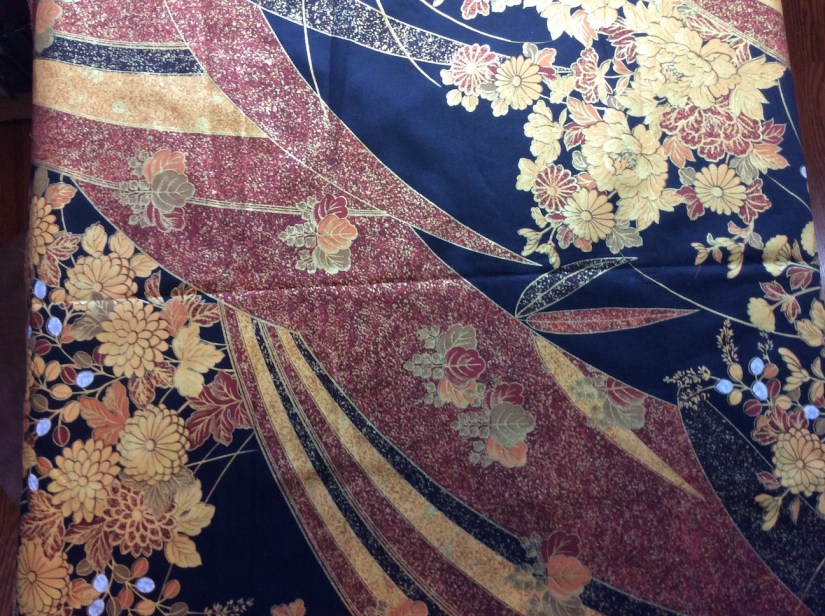
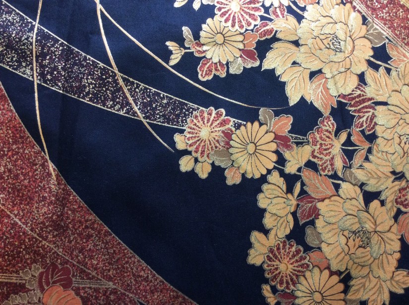
Here is a follow up on the post Mysterious Thrift Store Fabric Find: One of my blogger buddies, Claire @ knitnkwilt.wordpress.com, tapped into her resources and got a translation for the words on the selvage of my mysterious Asian fabric thrift store find:

ll the characters on the left say is ‘manufacturer/maker’. I’m guessing the ones just to the right of Watex are the company’s Japanese name. The handwritten characters say ‘Golden Age’
Thanks so much Claire for helping solve the mystery.
I had more ramblings for this Postscript, but you are likely exhausted after reading this very long post!